Web performance: How to affect perceived performance
01 Nov 2016This is the first in a series of articles about web performance. In this article, instead of diving into technical details, I’d like to focus on a less discussed but equally important topic: the perception of speed.
Perceived performance is a measure of how quick a user thinks your site is, and that’s often more important than its actual speed
As the name suggests, perception of speed is very subjective and context specific.
A great example of this is how long passengers have to wait at baggage claim at Houston airport. The airport executives, after receiving lots of complaints from passengers that it took too long to get their luggage, instead of increasing the number of airport personnel on the baggage claim, extended the distance from the arrival gate to the baggage claim sixfold. Passengers now had to walk six times the distance to get their bags and complaints dropped to near zero.
Another example is the mirrors in elevators. The rationale behind the mirrors was similar to the one used at the Houston airport: give people something to occupy their time, and the wait will feel shorter. The experience of waiting is defined only partly by the objective length of the wait. Occupied time (walking to baggage claim or checking your hair at the elevator mirror) feels shorter than unoccupied time (standing at the baggage claim carousel or counting the floors at the elevator).
Let’s see how we can apply similar tricks and techniques on the web in order to manipulate subjective time to our advantage.
Loading featured content first
A Nielsen-Norman Group eyetracking study found that a user who is served featured content within the first second of page load spent 20% of their time within the featured area, whereas a user who is subjected to an eight-second delay of a page’s feature content spent only 1% of their time visually engaging with that area.
For example, on the home page of a news website, the featured content may be the main article, while on an e-commerce website, it is the product image and description.
By ensuring the primary content loads first, we’re directing the attention of the user to the most important area of the page and suddenly the loading speed of the rest of the page becomes less important.
Using activity and progress indicators
If you have a known, slow operation that affects the user experience, consider using an activity indicator. Activity indicators reassure visitors that the page is actually functional and (wherever possible) give a sense of how much longer the visitor will need to wait.
Facebook did A/B testing to determine that users blamed FB on left, iOS on right, for slowness.
@deeje - January 31, 2014
Using progressive loading
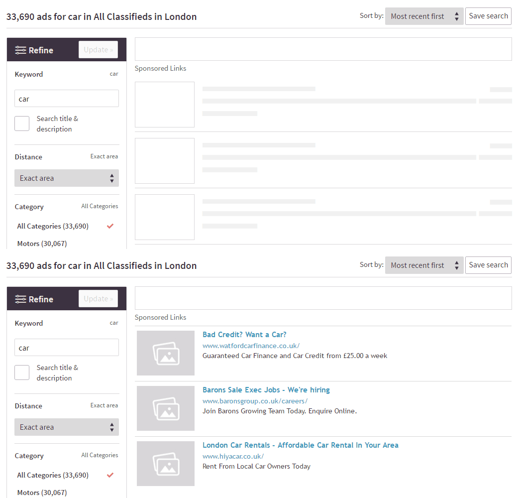
Another way to make people perceive loading as “quick” is to progressively load content. This approach is very common when loading images (progressive images). The basic idea of progressive images is to improve the user experience, as the image already takes its place, and progressively loads in different stages, from pixelated, to blurred, to sharp. By taking the basic idea of progressive images further, we can apply a similar technique on the actual content itself.
This technique is known as “content placeholders” or “skeleton layouts”:

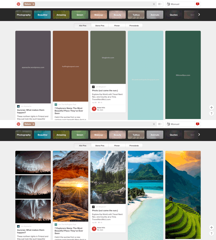
Pinterest optimised this technique even further. Instead of using a dummy, grey placeholder image, they use the dominant color of the image itself.

Facebook perfected this technique by combining an activity indicator with a content placeholder:

Using preemptive performance tricks
Another technique that you can use to make your application feel extremely fast is to preempt user actions before the user performs them. For example, let’s say you capture an image with your app. You start uploading that image before the user has actually said they’d like to upload the image. The user then enters a name and description, and by the time the user hits the upload button the image is already uploaded. Then, when the user does hit upload, they will be amazed at how quickly the upload took place. This is exactly what Instagram does in its app, and it is part of what set Instagram apart from their competition early on.
The perception of speed is very subjective. Using these techniques, we can take advantage of this perception and make the user’s experience seamless and delightful.